
Website Design Knowledge
Layout, CTAs, case pages, product pages, certifications — B2B websites from look to conversion
Your website is the first touchpoint for B2B sales. Buyers decide in 8 seconds whether to keep reading — design, CTAs, case pages, product pages, certification display all decide if they stay or leave. These 10 articles unpack each detail from the buyer perspective.
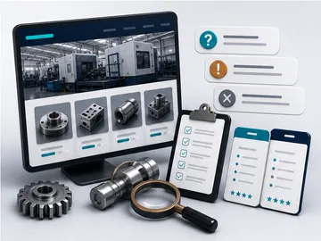
Q1. 7 Common B2B Website Problems That Make Buyers Leave
Buyers often decide within seconds whether a supplier website is worth reading. These problems quietly reduce trust.
Read more
Q1. 7 Common B2B Website Problems That Make Buyers Leave
Buyers often decide within seconds whether a supplier website is worth reading. These problems quietly reduce trust.
Read moreWhen a buyer enters a B2B website, they usually give you only a few seconds to decide whether the supplier is worth reviewing. If any of the following seven issues appears, they may simply close the page and compare the next supplier.
- The homepage does not explain what you do. Phrases such as "welcome" or "we are committed to the best service" do not help buyers understand your capability.
- There is no clear product category structure. All products are placed in one list, so buyers cannot find the specifications they need.
- There is no clear inquiry path. The contact page only has an email address, without a form, phone number, or LINE contact path.
- The mobile version is broken. Visitors need to zoom in to read content, and important buttons are difficult to tap.
- English or Japanese content is missing. For export-facing companies, this is a serious trust problem.
- There are no real product photos. If the site only uses renderings or stock images, buyers may suspect the company is a trading company rather than a manufacturer.
- The website has not been updated for years. If the news section stops in 2019, the company may look inactive.
The first three issues are usually the biggest reasons buyers do not inquire. If you are not sure which one applies to your website, start with the free website audit.
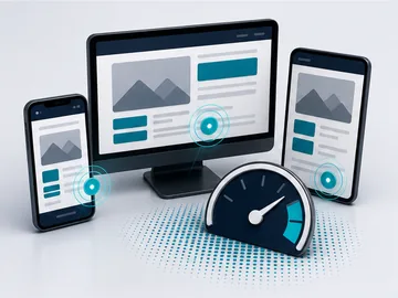
Q3. Why Responsive Design Alone Is Not Enough
A site can technically be responsive and still fail on mobile if the buyer cannot act quickly.
Read more
Q3. Why Responsive Design Alone Is Not Enough
A site can technically be responsive and still fail on mobile if the buyer cannot act quickly.
Read moreMany companies think that if a website is responsive, the mobile experience will automatically be fine. In reality, a buyer viewing your website on a phone still needs these five details to be handled well:
- Touch-friendly button size. Fingers are larger than a mouse pointer. Buttons should be at least 44 by 44 pixels, or they become hard to tap.
- One-tap contact information. Phone numbers should use tel links, addresses should link to Google Maps, and LINE contact should be easy to open.
- Compressed images. If desktop-size images are sent directly to mobile users, the page may take too long to load on mobile networks.
- Do not force visitors into a desktop version. Links such as "switch to desktop version" are an outdated pattern.
- Keep forms short. Filling forms on mobile is painful. Fewer required fields usually means a higher inquiry rate.
Many B2B buyers first use a phone to check whether a supplier is worth evaluating. If the mobile page is poor, the company may never get a serious desktop review.
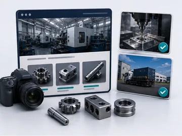
Q7. 6 Essential Photos Every Manufacturing Website Should Have
Real photos are one of the fastest ways to show that the company is a real manufacturer.
Read more
Q7. 6 Essential Photos Every Manufacturing Website Should Have
Real photos are one of the fastest ways to show that the company is a real manufacturer.
Read moreThe easiest mistake for a manufacturing website is using stock photos. Buyers can usually recognize them immediately, and they may suspect that the company is only a trader. These six kinds of photos are much more useful:
- Real product photos on a clean background. Buyers should be able to see product details and judge whether the part may fit their needs.
- Production line and factory photos. Show real equipment, CNC machines, inspection rooms, or factory areas to build trust that the company actually manufactures.
- Process-in-progress photos. Cutting, molding, coating, assembly, or other active process photos often feel more convincing than static images.
- Inspection and QC photos. CMM, optical measurement, SGS or TUV reports are especially important for export buyers.
- Packaging and shipment photos. Wooden crates, pallets, container loading, and export packaging show that the company can handle logistics.
- Team and office photos. A website should not show only empty equipment. A few real work or meeting photos help buyers feel there are people behind the company.
You do not always need a professional photographer. A mid-range phone, natural light, and a clean background are often enough. The point is authenticity, not stock-style beauty.
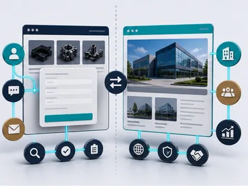
Q8. Inquiry-Driven Website vs Corporate Image Website
The two website directions solve very different business problems.
Read more
Q8. Inquiry-Driven Website vs Corporate Image Website
The two website directions solve very different business problems.
Read moreThese two website directions solve very different business problems. If the direction is wrong, even a beautiful website may not generate inquiries.
- A corporate image website is suitable when: the company has a long history, most customers come from existing relationships, new inquiries are not a priority, and the website's main job is to reassure existing customers. The content focus is brand story, company culture, CSR, and media coverage.
- An inquiry-driven website is suitable when: the company still needs new customers, wants website inquiries, is developing export or regional markets, or wants sales teams to use the site as a first filter. The content focus is product categories, specification tables, cases, inquiry forms, and catalog downloads.
Most YingCe ZhiZao projects are inquiry-driven. If your website has a sales job to do, such as generating leads, supporting export, or helping buyers compare suppliers, a purely image-based website may waste budget.
Q14. CTA Design: Why "Contact Us" Is a Dead Button in 2026
A generic "Contact Us" button has a conversion rate roughly 5× lower than a tiered, intent-matched inquiry CTA. Here's how to design them...
Read more
Q14. CTA Design: Why "Contact Us" Is a Dead Button in 2026
A generic "Contact Us" button has a conversion rate roughly 5× lower than a tiered, intent-matched inquiry CTA. Here's how to design them...
Read more"Contact Us" is a generic CTA. Visitors don't know what happens when they click — will it open an email? A form with 15 fields? Will someone actually reply?
Replace it with tiered CTAs matched to buyer intent:
- High intent → "Request a Quote" / "Start Inquiry". Form pre-populates the product they were viewing. 3 fields max.
- Mid intent → "Download Spec Sheet (PDF)". Email required, instant download. Builds your lead list without scaring off the buyer.
- Low intent → "Book a 30-Min Consultation". Calendly-style scheduling. Buyer-controlled, low pressure.
- Emergency / mobile → click-to-call. Sticky bottom bar on mobile, one tap to your sales line.
The 3 essentials of a working CTA:
- Verb + specific outcome: "Request a Quote" beats "Submit". "Download Spec Sheet" beats "Click Here".
- Visual contrast: brand accent color, minimum 44×44px touch target, never a grey-on-grey button.
- Place repeatedly: hero, after each content block, footer, and sticky on mobile. Same primary CTA throughout the page.
Real data from our B2B clients: replacing "Contact Us" with tiered CTAs typically lifts form conversion from 0.5% to 2-3% — same traffic, 4-6× more inquiries, zero new ad spend.
Q17. How to Write Case Studies Buyers Actually Inquire After Reading
B2B buyers don't read case studies for "client logo walls". They read for concrete results + scale + process detail. 5 blocks every case page needs...
Read more
Q17. How to Write Case Studies Buyers Actually Inquire After Reading
B2B buyers don't read case studies for "client logo walls". They read for concrete results + scale + process detail. 5 blocks every case page needs...
Read moreB2B buyers don't read case studies for client logos. They read to verify: "Has this supplier done something at my scale, with my technical requirements?"
5 blocks every case study page needs:
- Client identity (or anonymized + scale). If NDA, use industry + size: "A US top-3 consumer electronics brand" works as well as a logo for purchasing teams.
- The technical challenge. Specific: "PA66+GF30 with ±0.05mm tolerance, 500K units/month, IATF 16949 certified."
- The process. Equipment used, materials, certifications applied. 2-3 sentences max — buyers don't need a thesis, just proof you understand the craft.
- Quantified results. Production volume, defect rate, on-time delivery, years of partnership. Numbers always beat adjectives.
- Photos. Real product photos, not renderings. Real factory photos, not stock images. Multiple angles. This is what separates a manufacturer from a trading company in the buyer's eye.
Common mistakes:
- Logo wall with no context — buyer can't tell what you actually did for each client
- Generic adjectives ("high quality", "professional") — no quantification
- Renderings only — looks like a trading company website
See practical examples in our case studies page.
Q18. How to Display Certifications Without Looking Like a "Logo Wall"
A row of ISO / IATF / AS logos at page bottom = 90% of visitors scroll past. Treat certifications as proof of process, not decoration...
Read more
Q18. How to Display Certifications Without Looking Like a "Logo Wall"
A row of ISO / IATF / AS logos at page bottom = 90% of visitors scroll past. Treat certifications as proof of process, not decoration...
Read moreA row of ISO / IATF / AS / CE logos at page bottom = 90% of visitors scroll past without registering them. They've seen the same logos on every supplier site since 2008.
Treat certifications as proof of process, not decoration:
- Attach each cert to a specific capability page. ISO 9001 alone is meaningless; "IATF 16949 + ±0.05mm tolerance + 5M units monthly" is a complete answer to the automotive buyer's question.
- Show the certificate body. Certified by TÜV / BSI / SGS / Bureau Veritas — these are recognized; "certified" alone isn't.
- Link to a downloadable PDF of the actual certificate (with serial number). Buyers can verify on the certification body's website. This single move dramatically increases trust signals.
- Mention scope. ISO 14001 for "Plastic injection — facility A" is more meaningful than "we have ISO 14001".
- Renewal date / current validity. Buyers check this before adding suppliers to approved lists.
Sample placement on a product page:
"Manufactured under our ISO 9001 + IATF 16949 quality system (certificates: TÜV Süd #50100xxxxxx, valid through 2027-09). Tolerance verified by CMM measurement on every batch."
One sentence with cert body + number + scope + validity = stronger than 12 logos in a row.
Q21. What Is a CTA? Why a Page Without One Wastes All Its Traffic
CTA (Call To Action) = the button that tells visitors what to do next. Building a beautiful showroom but no checkout = a website without a CTA...
Read more
Q21. What Is a CTA? Why a Page Without One Wastes All Its Traffic
CTA (Call To Action) = the button that tells visitors what to do next. Building a beautiful showroom but no checkout = a website without a CTA...
Read moreCTA = Call To Action. Plain language: the button that tells visitors what to do next. Examples: "Request Free Audit", "Download Spec Sheet", "Get a Quote", "Add Us on LINE", "Book a 30-Min Consultation".
In business terms: you've built a beautiful showroom, but visitors finish browsing and don't know where to check out = a website without a CTA. No matter how much traffic you have, no CTA = no result.
3 essentials of a working CTA:
- Verb + specific outcome. "Download PDF Catalog" beats "Learn More". "Learn More" is the death phrase of CTA design — visitors don't know what happens when they click.
- State the value clearly. "Free Website Audit (30 sec)" beats "Click Here" by 10×. State the benefit + the cost (time).
- Visually prominent. Use brand accent or high-contrast color. Buttons should be ≥44px tall on mobile, ≥48px on desktop. White-on-dark or dark-on-white — never grey-on-grey.
How many CTAs per page? Not "more is better". Standard B2B setup:
- Primary CTA (what you most want visitors to do, repeated 2-4× per page, same wording): e.g., "Request Free Audit"
- Secondary CTA (alternative for not-quite-ready visitors): e.g., "Book a 30-Min Chat", "Download Catalog"
Where to place CTAs:
- Hero (above the fold, first impression)
- End of each content block (right after a value proposition)
- Page bottom (for visitors who read everything)
- Sticky bottom bar on mobile (always accessible)
Real data: changing "Learn More" to "Request Free Audit" typically lifts form conversion from 0.5% to 2-3% — 4-6× more inquiries on the same traffic, zero new ad spend.
Q24. What Makes a Good "Engineering Project Page"? What to Include and Avoid
Engineering project pages are for PMs, owners, and supervisors looking for evidence "you can deliver". Not about looking beautiful — about convincing them...
Read more
Q24. What Makes a Good "Engineering Project Page"? What to Include and Avoid
Engineering project pages are for PMs, owners, and supervisors looking for evidence "you can deliver". Not about looking beautiful — about convincing them...
Read moreEngineering project pages (fire safety, MEP, solar EPC, waterproofing, plant fit-out, datacenters) face an audience of owners, PMs, facility managers, supervisors, and general-contractor purchasing teams. They're not looking for "aesthetics" — they're looking for proof that you can complete the work legally, safely, and on time.
8 essential blocks for a strong project page:
- Project metadata: industry (semiconductor plant / 5-star hotel / hospital / school / office tower), location (central / southern), scale (square footage / room count / kW capacity). PM can match against their project in one glance.
- Real construction photos: in-progress + completed + close-ups, three types. Don't just show beauty shots — show ones that demonstrate complexity (high-altitude work, mechanical rooms, special environments).
- Scope detail: turn-key or trade contractor? Which trades covered (alarm + sprinkler + suppression + smoke control, or MEP + low-voltage + UPS)? Lets buyers know if you can do what they need.
- Scale and timeline: contract size as a range (e.g., USD 1-1.5M tier), project duration, peak headcount on site. Lets PMs gauge if you can handle their scale.
- Technical details: equipment brands used (Siemens / Mitsubishi / Honeywell), standards followed (NFPA / CNS / IBC), unique challenges solved. These are the "real skill" indicators peers recognize.
- Client identity: named if possible; anonymized with size description if NDA ("A central-region semiconductor packaging plant", "A northern 5-star hotel, 150 rooms renovated").
- Owner / architect / supervisor testimonial (optional): if available, include. Don't fabricate. Helps similar-profile owners decide.
- Certifications and insurance for this project: fire system engineer license, Class A electrician, construction insurance amount, third-party liability. Shows "legal + accountable".
Common NG patterns:
- Beauty shots only — can't tell construction complexity
- "High quality, trustworthy" empty adjectives — no scale / certification / numbers
- No timeline — PM can't tell if you deliver on time
- Over-anonymization (every client = "Client A") — looks fabricated
- No CTA — visitor read the case, wants to inquire, finds no entry point
Quantity guidance: 6-12 representative projects beats 100 thin entries. Quality over quantity. Each project written fully beats 100 with titles only.
See practical examples on our case studies page.
Q25. What Makes a Good B2B Product Page? How Is It Different From E-commerce?
B2B product pages serve buyers, technical leads, and R&D — not consumers. No "Buy Now" — instead "Request Quote / Download Spec Sheet / Order Sample". Evidence first, marketing second...
Read more
Q25. What Makes a Good B2B Product Page? How Is It Different From E-commerce?
B2B product pages serve buyers, technical leads, and R&D — not consumers. No "Buy Now" — instead "Request Quote / Download Spec Sheet / Order Sample". Evidence first, marketing second...
Read moreB2B product pages (industrial parts, machinery, raw materials, consumables, commercial equipment) are completely different from e-commerce product pages. E-commerce serves "consumer impulse purchase"; B2B serves "evaluation before internal approval".
4 key differences:
- E-commerce: Add to Cart / Buy Now → B2B: Request Quote / Download Spec / Order Sample
- E-commerce: user reviews matter most → B2B: certifications, specifications, case studies matter most
- E-commerce: promotional discounts → B2B: MOQ, lead time, customization options
- E-commerce: emotional / lifestyle → B2B: evidence / quantification
9 essential blocks for a strong B2B product page:
- Multi-angle product photos: real photos, not all renderings. Buyers fear "trading company photos" — they need to see the manufacturer actually has stock. 3-6 photos. Add 360° rotation or short video if possible.
- Full specification table: dimensions, material, tolerance, weight, certifications, configurable options. Tabular — not buried in paragraphs. Buyers should be able to copy into internal evaluation sheets.
- Application scenarios: which industries / systems / equipment use this product? Compatible with which OEM main equipment? Lets R&D check compatibility instantly.
- Technical document downloads: spec sheet (PDF), 3D files (STEP / IGES), CAD (DWG), datasheets. These are what gets buyers to advance. Can require email before download (lead capture).
- Certifications and standards: CE / FDA / UL / RoHS / REACH / IATF / AS9100 — list which are passed, include cert numbers or download links.
- MOQ / lead time / customization: minimum order quantity, standard lead time, customizable elements (color / size / packaging). Buyers care about these most.
- Inquiry / sample request CTA: form pre-populates product code, doesn't make visitor type. Offer 3 levels: Quote / Spec Sheet / Sample.
- Related product cross-recommendations: same series, paired items, alternatives. Lengthens session, raises basket size.
- Product-specific FAQ: 5-8 questions most often asked about this product. Bonuses GEO + SEO.
SEO / GEO add-ons:
- Each product page adds
Schema.org/Productstructured data (price range, manufacturer, MPN, GTIN) - Product FAQ adds
FAQPageschema - Product title uses "industry search term + spec" ("PA66+GF30 glass-fiber injection OEM"), not "our premium product"
- Alt text on each photo is specific ("PA66+GF30 injection part, IATF 16949 certified")
Quantity guidance: do 10-30 core products fully, not 500 half-baked. Buyers want depth, not SKU count. Remaining can be covered by a full PDF catalog download.
Want to know where your product pages can improve? Start with free website audit or see other factories' approaches in case studies.
Read everything and still
not sure where to start?
Enter your URL, get a 30-second free audit. We'll tell you which recommendation best applies to your situation.